
Many of you may be familiar with the name Pantone in association with color for designers. "In 1963, Lawrence Herbert, Pantone's founder, created an innovative system for identifying, matching and communicating colors to solve the problems associated with producing accurate color matches in the graphic arts community. His insight that the spectrum is seen and interpreted differently by each individual led to the innovation of the PANTONE® MATCHING SYSTEM®, a book of standardized color in fan format." (http://www.pantone.com/pages/pantone/pantone.aspx?pg=19295&ca=10) Pantone has become the industry standard in color matching for artists and designers of all kinds.
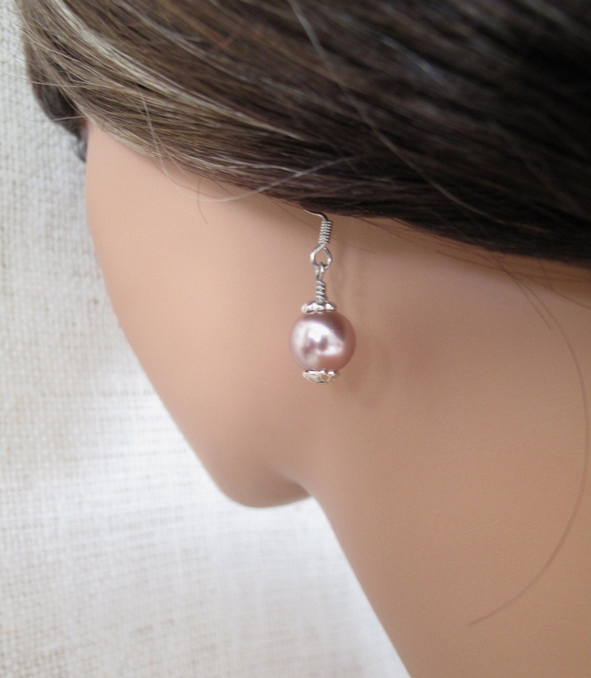
Pantone also surveys leading fashion industry experts in order to determine the top inspiration color trends for each season and each new year. From this information they develop their Pantone color forecast chart with standardized hues that can be reproduced by professionals in graphic arts, architecture and home furnishings, paint manufacturers, fashion marketing, and industrial design. According to Pantone's market research, the 2011 color of the year is "honeysuckle," a vibrant reddish pink. Honeysuckle is described as "encouraging and uplifting. It elevates our psyche beyond escape, instilling the confidence, courage and spirit to meet the exhaustive challenges that have become part of everyday life." (http://www.pantone.com/pages/pantone/Pantone.aspx?pg=20821&ca=4)
 | |||
| From the Pantone website |
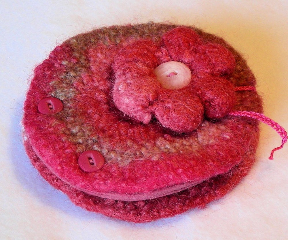
by JN Originals
by Sixsisters
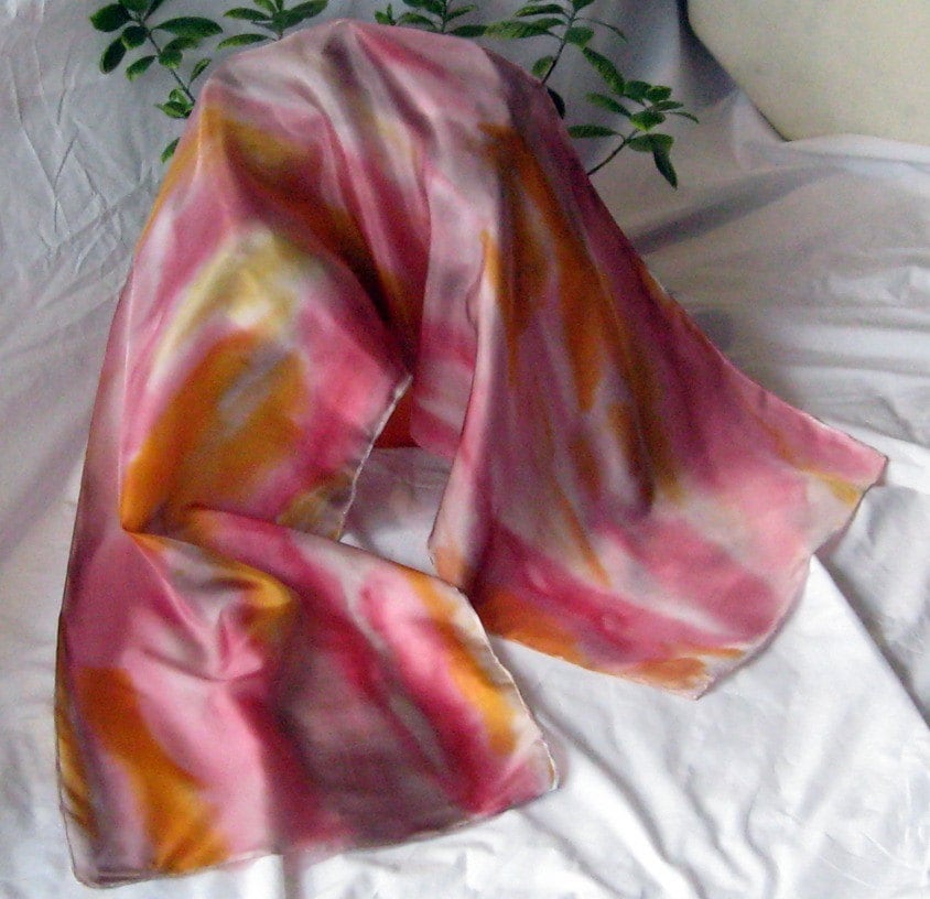
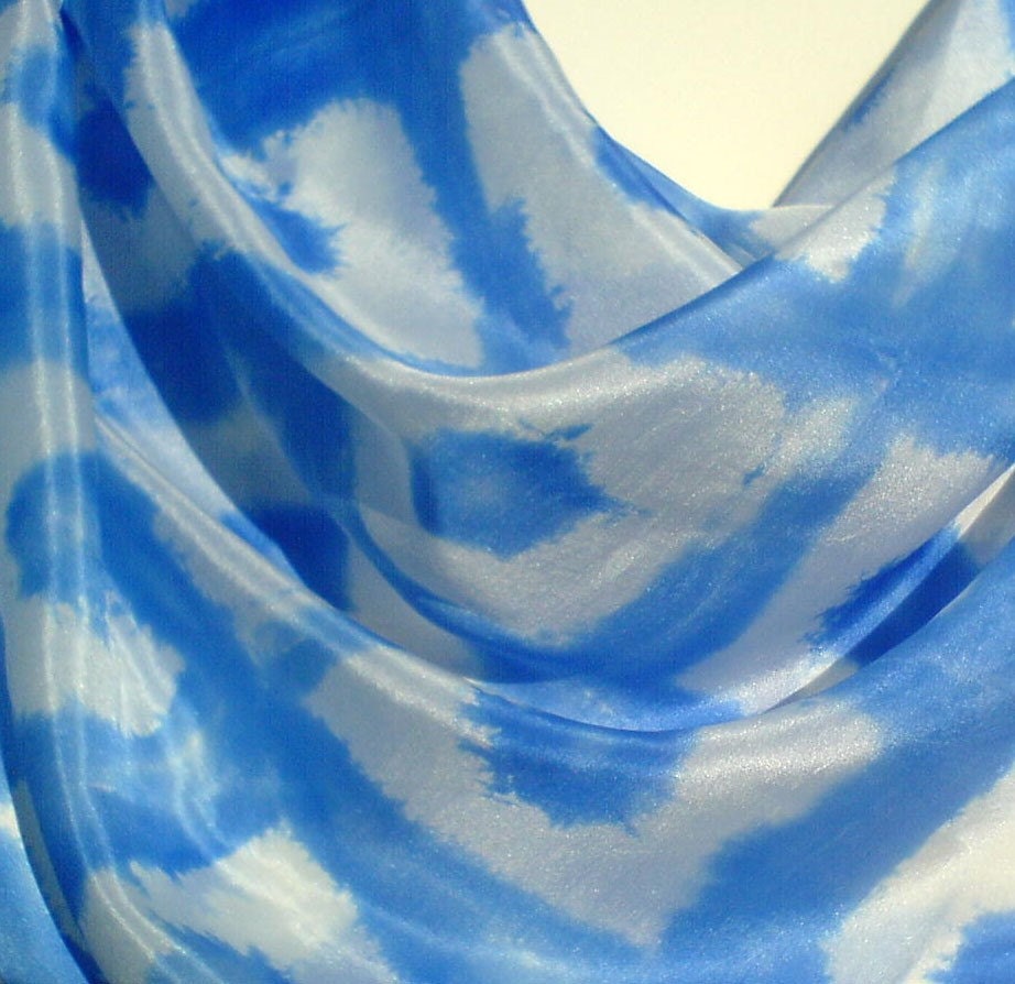
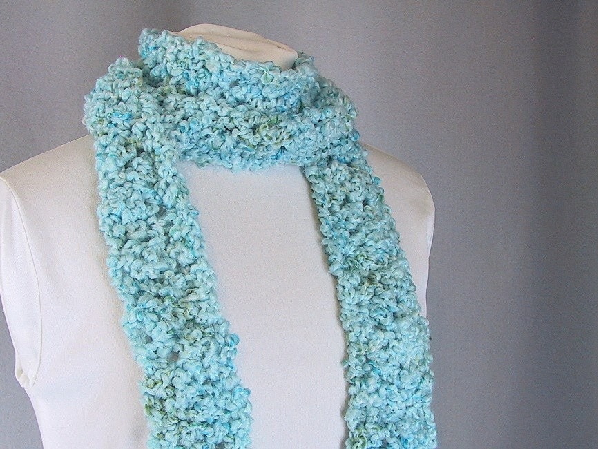
by Mystic Silks

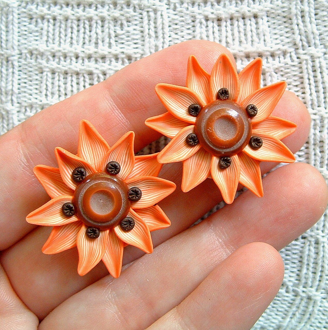
"Coral Rose" is said to be a sophisticated shade of orange that takes its inspiration from African, Indian and Asian influences.
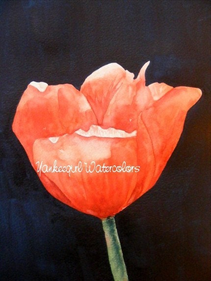
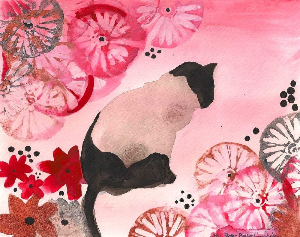
by Yankeegirl
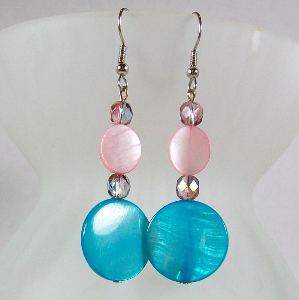
by ZudaGay

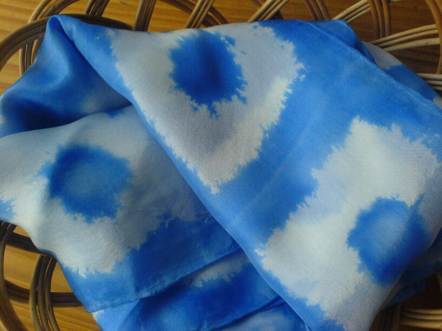
"Peapod" is a fresh, medium green tone meant to evoke thoughts of travel and adventure.
from EverSoDear

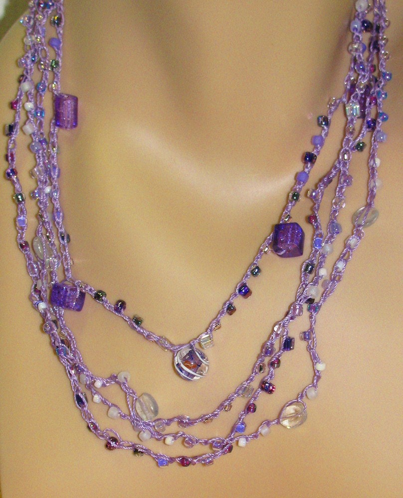
by Backroom Treasures

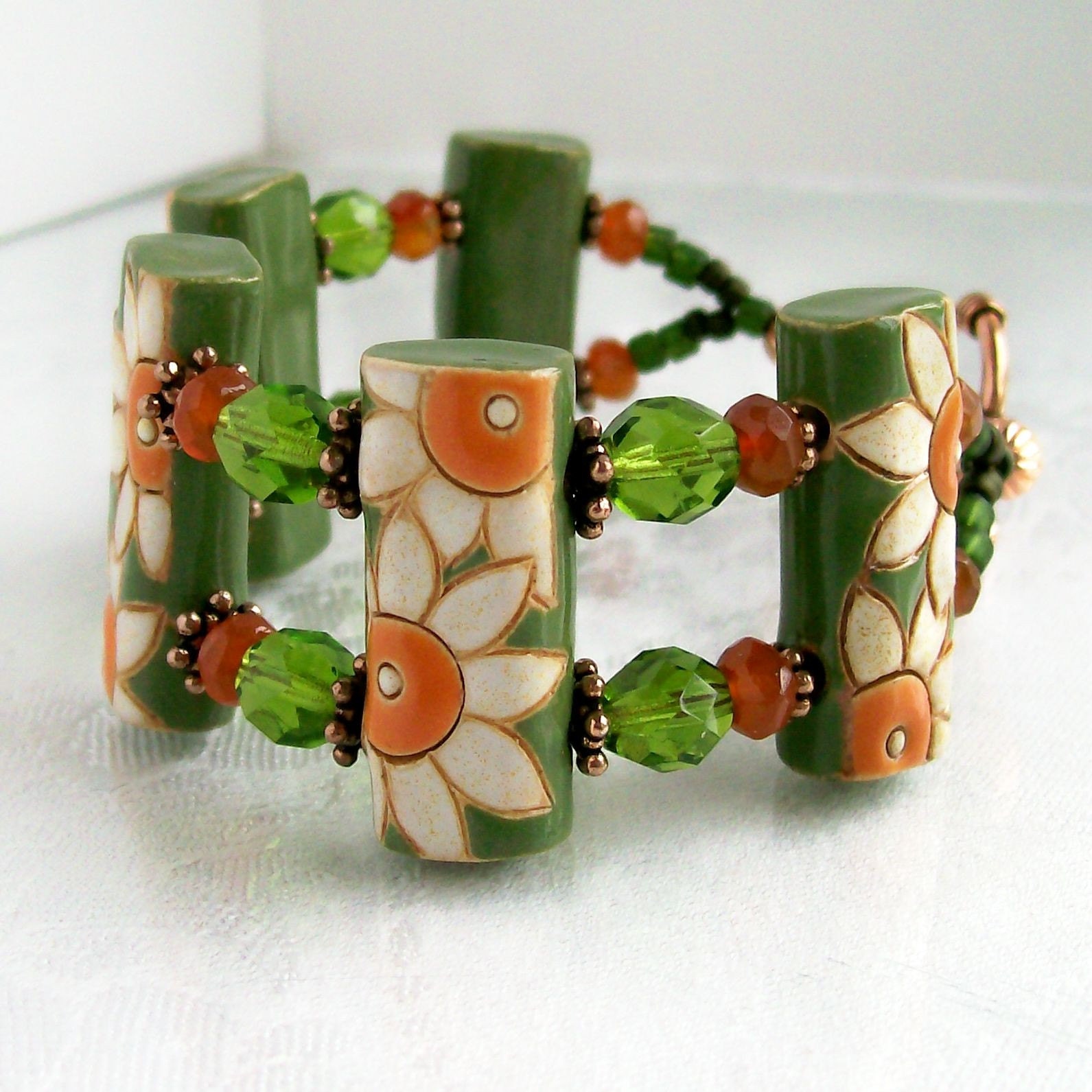
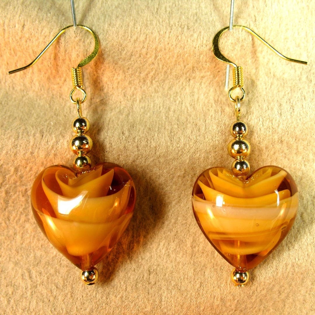
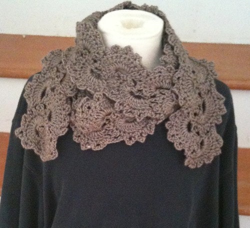
"Beeswax" is a modernized ochre or golden tone which is cheerful and playful.
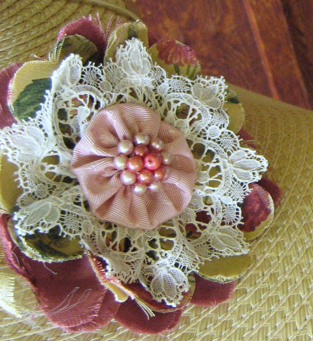
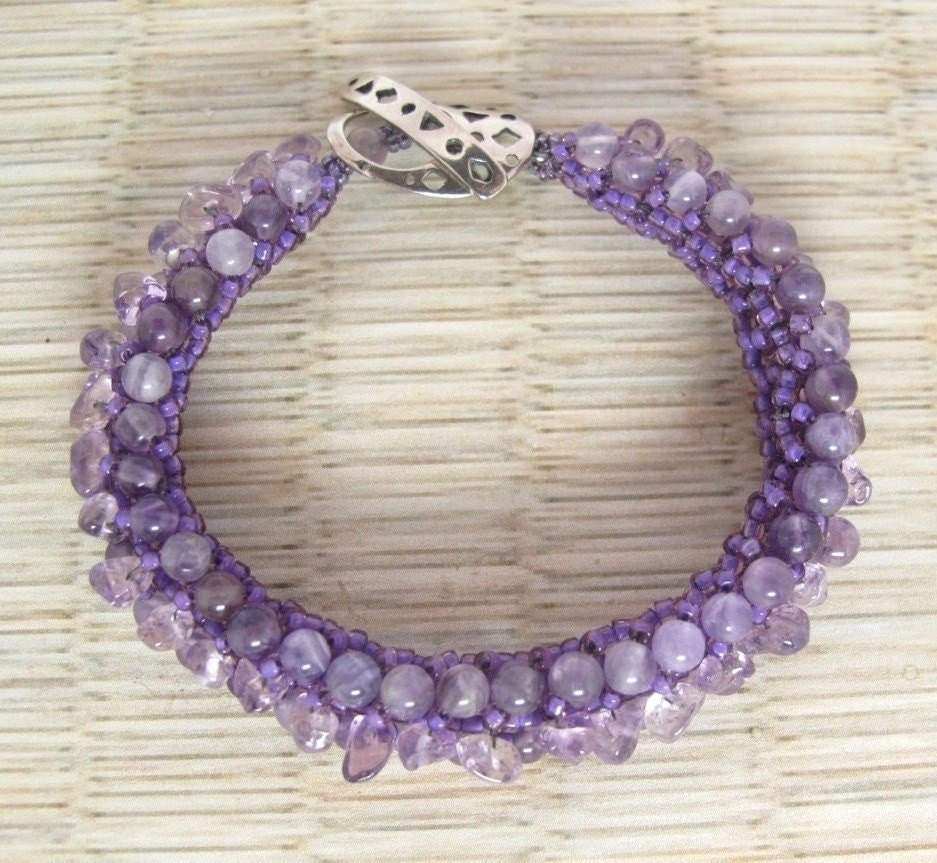
by Fantasy Creations 1

from Designs by Christine


8 comments:
I have heard of Pantone, but did not know much about it, so I appreciate the explanation provided in your post. I love how you have broken out the spring 2001 colors by featuring BBEST products in those same colors--how fun! Thanks also for featuring my needle book.
Liv this is wonderful. I love how you managed to get
so many bbesters included in this blog. The color
scheme really works. Thanks !
very interesting info. I like how you showed the swatch and found items that matched. Thx. for inc. my lavender necklace.
Once again I learn something new from a bbester!! Great post and thanks for including my watercolor!
Great post, Liv! I love your spring color palate choices! Well done!
Great post! Thank you for the information. I was not familiar with Pantone, but I had heard that the color of the year was honeysuckle. Now I know what color that is!!! Thank you for including my earrings!
The beauty of Spring with all its vibrant and budding color palette is well represented by your thoughtful blog, and your many choices filling Springs beauty.
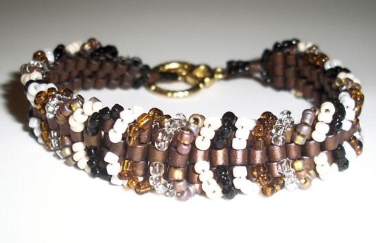
Thank you for including my bracelet among these other Spring delights!
Thanks for sharing the spring colors - and for including my flower from Imaginuity.etsy.com!
Post a Comment