Showing posts with label color theory. Show all posts

Sunday, April 3, 2011

Pattern Possibilities

During a weaving class I recently attended, I became acquainted with an interesting book on textile design:  The Fabric Design Book: Understanding and Creating Patterns Using Texture, Shape and Color, by Karin Jerstop and Eva Kohlmar. Although the book is aimed at crafters who work with fabric, the basic pattern ideas it presents are useful for all artisans who are interested in creating unique designs for their art works. The book contains ample color illustrations and plenty of visual inspiration for demonstrating how simple lines and shapes can be used to build more complex patterns.

Let's take a look at some of the pattern basics that form the groundwork for design exercises in The Fabric Design Book. Examples from our BBEST team will help illustrate these design elements.

Intricate design structures start with the spacial arrangement of simple geometric shapes and the interplay of varying shades of color. Our tools for increasing complexity and creating unique patterns include repeating shapes, rotating shape or line direction, alternating colors, increasing and decreasing pattern size, and adding surface texture. We can combine techniques as well, broadening the scope of our design possibilities.


The simplest design form is a line. We can use horizontal and vertical lines to divide an area into sections, creating stripes. By varying the thickness and spacing of these lines, we can make many symmetrical and asymmetrical patterns. Lines can be evenly spaced, or they can be alternated, thick and thin; they can also be turned at a diagonal angle. Applying color to stripes adds an extra design dimension. Using Fibonacci numbers, we can apply the mathematical principles Italian mathematician Fibonacci discovered in patterns throughout the natural world to create balanced and eye-pleasing stripe sequences. Making our stripes in size ratios that follow Fibonacci numbers - 1-1-2-3-5-8-13-21 and so on, will create a striped pattern that mimics the regular and harmonious patterns found in such things as "shell spirals, branching plants, flower petals, seeds, pine cones, and leaves." (http://www.fuzzygalore.biz/articles/fibonacci_seq.shtml)
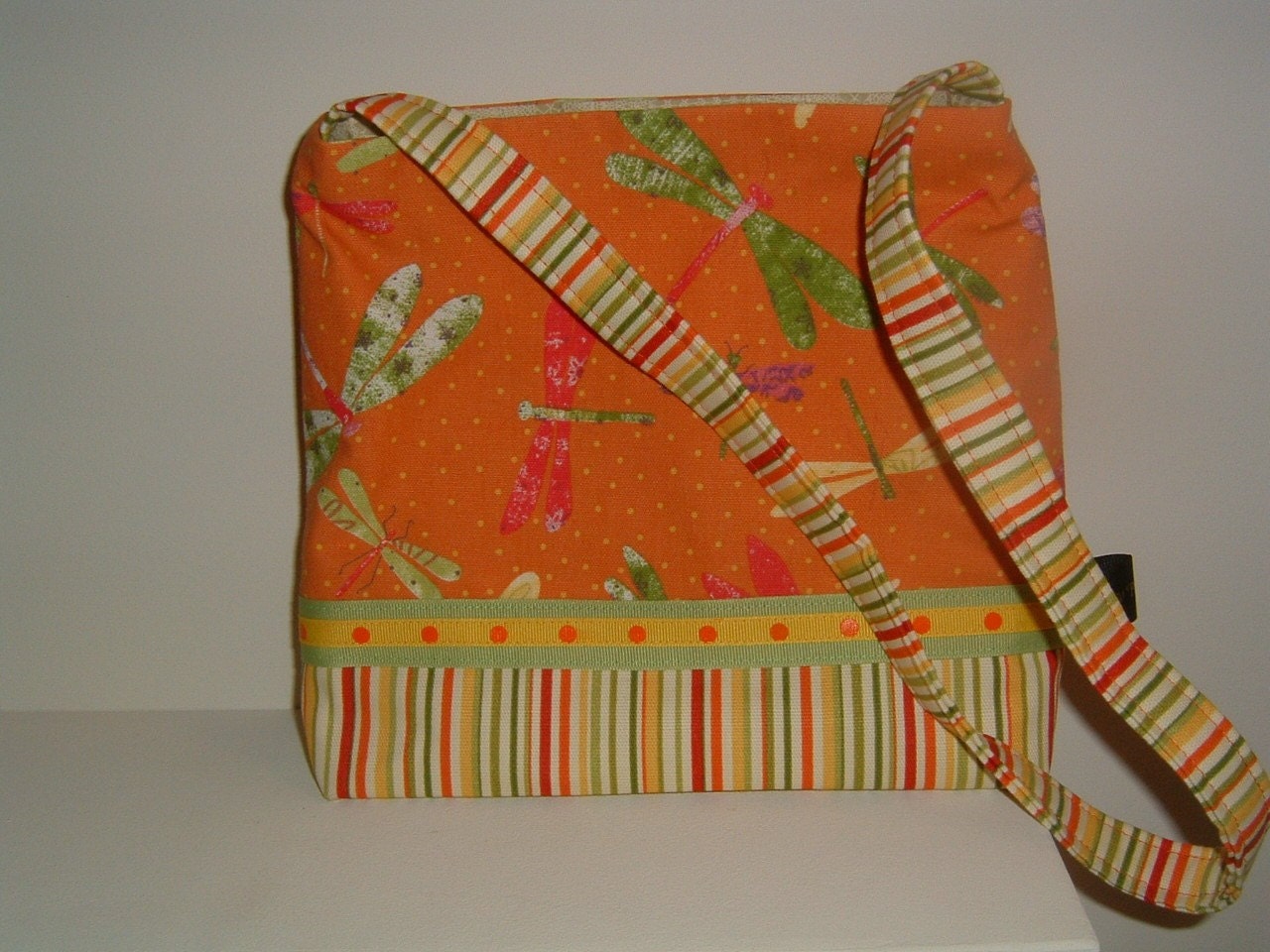

A natural step up from stripes, is the plaid, which is created by crisscrossing lines of varying sizes at right angles to one another. This interlacing of lines leads to checks and squares; crossing the lines diagonally gives us diamond patterns. Another variation of the plaid is a brick design, which is still an interlocking of lines. We can also apply Fibonacci-style line dimensions to the building blocks of plaids, to design visually appealing patterns.


Another method for creating patterns is to repeat geometric shapes, such as squares, triangles, rectangles, circles, wavy lines, and spirals. Some of the earliest forms of decorative art utilized this technique. Starting with a single line of repeating shapes, we can make borders, which can then be repeated to make more advanced and complex overall patterns. Again, adding color variations greatly increases the design potential.
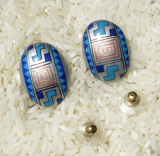
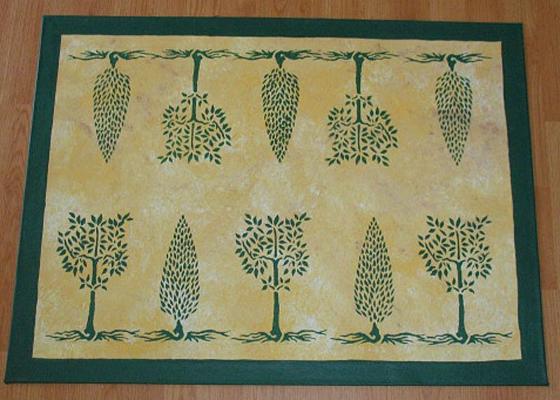
Growing beyond basic geometry, we can repeat, or repeat and alternate design elements, such as leaves, animals, dots, or even very intricate pictures, to make sophisticated surface ornamentation.


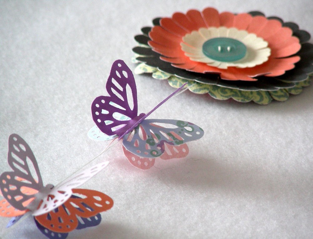
The lack of a pattern is just as important as the presence of one. We can look at the negative space created by the absence or removal of line and color as a design element in itself. For example, taking a piece of paper and cutting away sections creates a lovely pattern, as in the butterflies below.

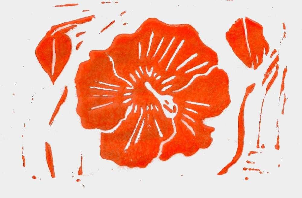
By simplifying and stylizing a physical object, we can change it to an artistic form. Rather than reproducing something, such as a flower, in exact detail, we can distill its essence to create a unique design motif. Further simplification of such a motif will continue to develop new design elements. Don't forget we can also repeat these stylized elements to make overall patterns. Combine negative space with simplified designs, and we create elegant pictorial representations.
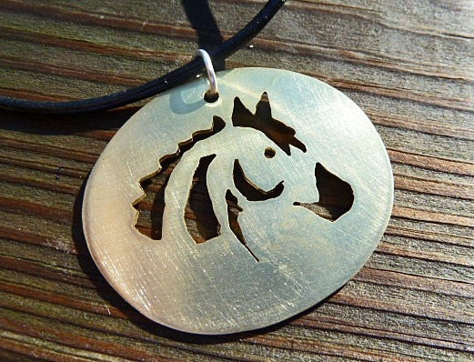

Another way of manipulating shapes is to use mirror images. Think of taking a design element on one side of a piece of paper and folding the paper, or holding it up to a mirror, to create an exact but reversed image next to the original. We can mirror and repeat as well, just as we did with simplified images, to form a larger pattern.
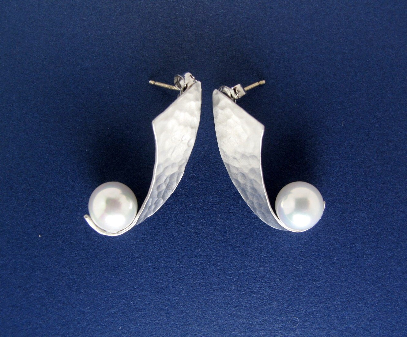

Adding color to our design repertoire steps up our pattern options exponentially. We can take repetitive, basic shapes and colorize them, such as alternating hues, following a rainbow spectrum, taking different shadings of one tone, or following complementary or analogous schemes.
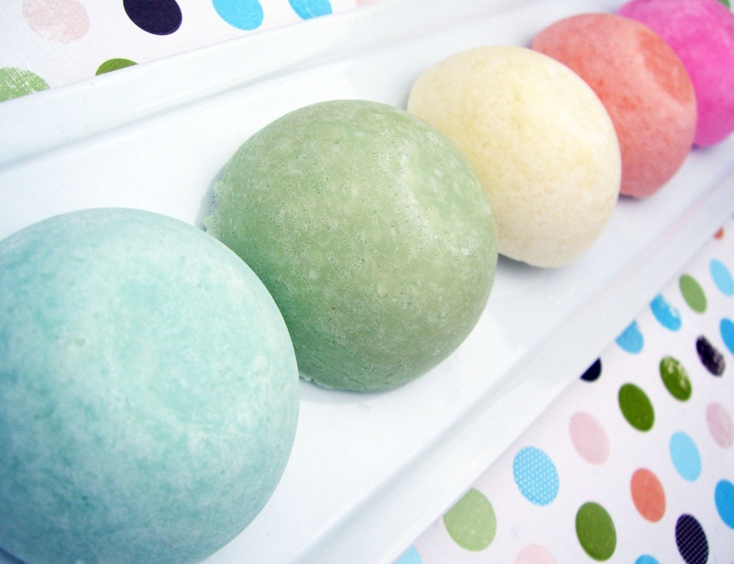

Using large blocks of color juxtaposed creates striking patterning effects. Patterns need not be extremely complex when dramatic color usage is the prime artistic tool.


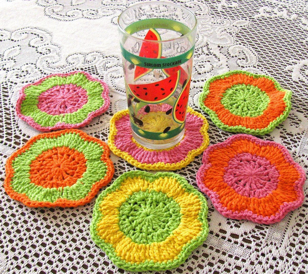
The qualities of a color, such as intensity, shade, tone, tint, and value, change when that color is combined with various other colors. We can try pairing one color, such as the green in these coasters, with colors that are adjacent or opposite on the color wheel to see what affect this combination has on the qualities of the original color.
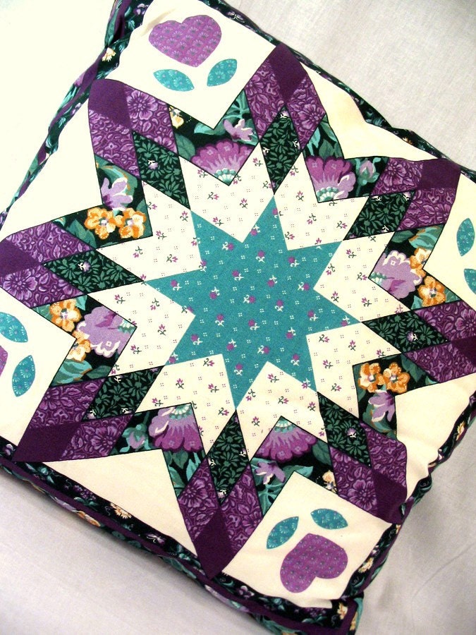
 This quilt blends a number of the techniques we have already considered by repeating geometric shapes filled with coordinating patterns, and harmonizing analogous colors. As you can see, the design possibilities are endless! Start by playing with basic shapes, add your own creativity, and you will soon discover that unique patterns are within easy reach of every artisan.

from ByTheBy

Friday, August 27, 2010

A rose is a rose...

...but "rose," as a color, comes in many variations depending on who you are and the culture in which you live. Much of color description is subjective. By definition, color is "the quality of an object or substance with respect to light reflected by the object, usually determined visually by measurement of hue, saturation, and brightness of the reflected light; saturation or chroma." (Dictionary.com) In other words, pure white light is composed of an infinite spectrum of visible colors, though we only see a small percentage of them. The surfaces of all objects reflect some light wavelengths and absorb all the others. We perceive color when those reflected wavelengths reach the light receptors within our eyes and a message is transmitted to our brains. This working of the eye and brain together creates what we experience as color. (Pantone.com)  

Because the human brain is such a complex entanglement of memories, sensory and physical experiences, cultural interpretations, emotions, and thought processes, perception of color becomes more than mere recording of incoming light waves. Each person will "see" a color differently based on this meshing of physical stimuli (light) and the stored information the brain uses for interpretation. Many of us are familiar with the basic hues of the color wheel, that rainbow-like, circular progression of colors that represents primary, secondary colors, and tertiary colors. We can thank Sir Isaac Newton for this neat diagram which he created in 1666. "The renowned English scientist was 23 years old at the time. He was made to stay home from Cambridge University for over a year because the plague that was sweeping Europe had closed it down. It was during this period that Newton performed his famous spectrum experiments. To alleviate the boredom of quarantine, he punched holes in the curtains of his darkened room to study the effects of light passing through a prism. The light separated into the same progression of colors found in the natural rainbow." (Pantone.com)

Courtesy of the University of Minnesota 
http://www.sustland.umn.edu/design/colortechniques.html
Once we go beyond the basic colors we all learned in Art 101, naming and classifying gets a little more complicated...and interesting. Colors start to become associated with our emotions, cultural traditions, and physical surroundings, lending another hand in how we define certain hues. Nature has inspired many of our color names. With flowers, birds, and gems for inspiration, we get colors such as cardinal, daffodil, chestnut, sand, lavender, rose, eggshell, violet, emerald, fern, flamingo pink, lilac, goldenrod, mint green, copper, ruby, sapphire, straw, turquoise, and robin's egg blue. Considering how important food is to human societies, it is no surprise that a large number of colors are associated with our favorite foods: almond, pumpkin, lime green, lemon yellow, orange, apple green, banana, persimmon, cherry red, candy apple red, watermelon, bubble gum, cinnamon, maize, cotton candy, cream, chocolate brown, olive green, raspberry, tangerine, saffron, eggplant, honeydew, mustard, pistachio, plum, and vanilla. (Are you getting hungry yet?) 

Although some colors are generally agreed upon, finer distinctions of shade and exact hue vary widely from person to person. There isn't any standardization of color naming; even if there was, it would be difficult to tell exactly what color someone meant if he or she named a color because each person's brain interprets those light wavelengths differently. If I said an object was red, you might have a general understanding of what color I was talking about, but you might picture fire engine red while I was thinking of brick red. Some color names have been used interchangeably even though there are slight differences in hue. For example, aqua, aquamarine, cyan, turquoise, blue-green, green-blue, and verdigris are often used to describe some type of cross between blue and green. And lest you think that white and black are pretty safe to describe, keep in mind that even these "non-colors" can march subtly into the color spectrum. White might be antique white, champagne, eggshell, ivory, lavender blush, light goldenrod, linen, magnolia, or snow white; black could be charcoal, ebony, smoke, onyx, or jet black. It's all literally in the eye of the beholder. If any of you remember the 1948 Cary Grant and Myrna Loy movie, Mr. Blandings Builds His Dream House, you might recall this famous scene about paint colors that humorously illustrates how our views of color can cause a disconnect:


The list of colors in the English language alone is quite extensive. Some are very familiar, some are less common, and some are downright obscure. You may have heard of citrine, ochre, aubergine, azure, claret, and celadon, but could you point to something fulvous or piceous in color? Well, I admit I couldn't do so before I wrote this blog post! Let's explore a few unusual color names by means of a little matching game. Listed below are some colors that you may or may not recognize, followed by pictures of items made by members of the BBEST team. Try matching the color name with the item that most closely resembles that color...or take a best guess. Good luck!

Colors:
1. fulvous
2. piceous
3. alizarin
4. viridian
5. vinaceous
6. smalt
7. aureate
8. heliotrope
9. rufous
10. argent

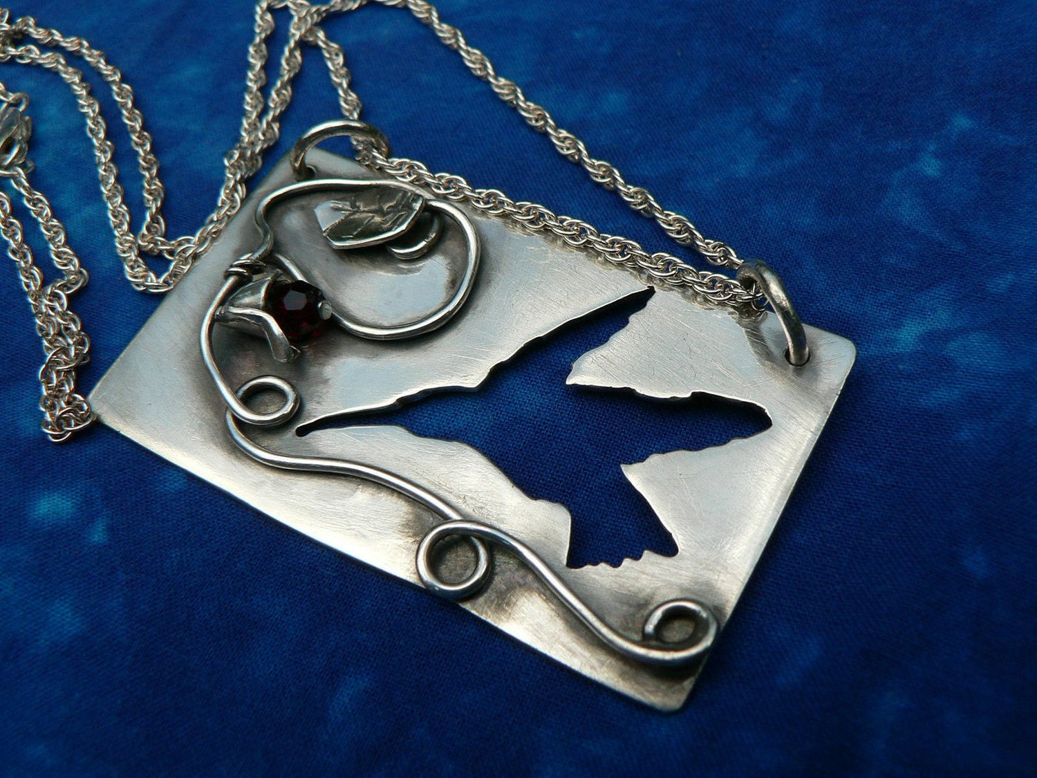
A. Hummingbird On The Fly Pendant by Hemlock Hollow Creations
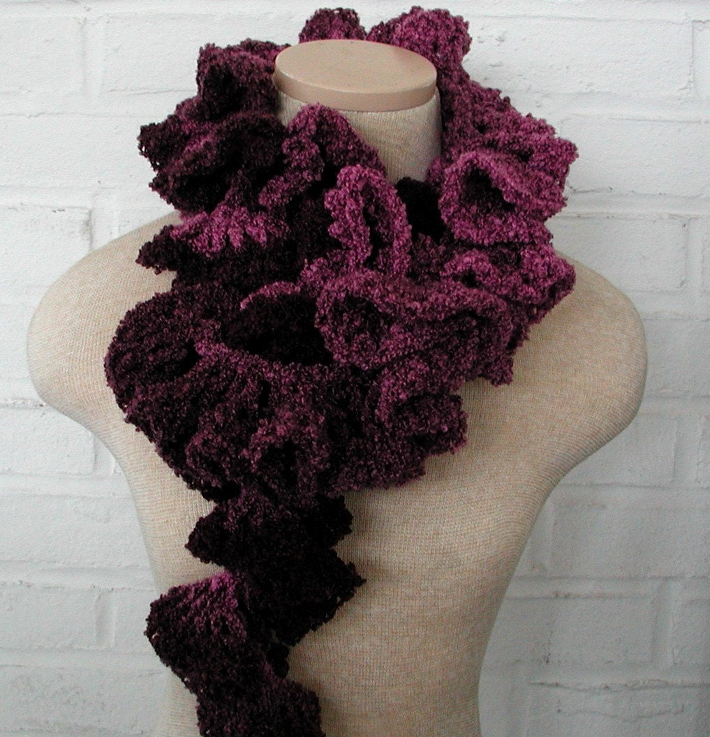
B. Burgundy Purple Ruffle Crochet Scarf by Blazing Needles


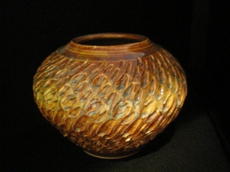
C. Textured Golden Vessel by Artsielady
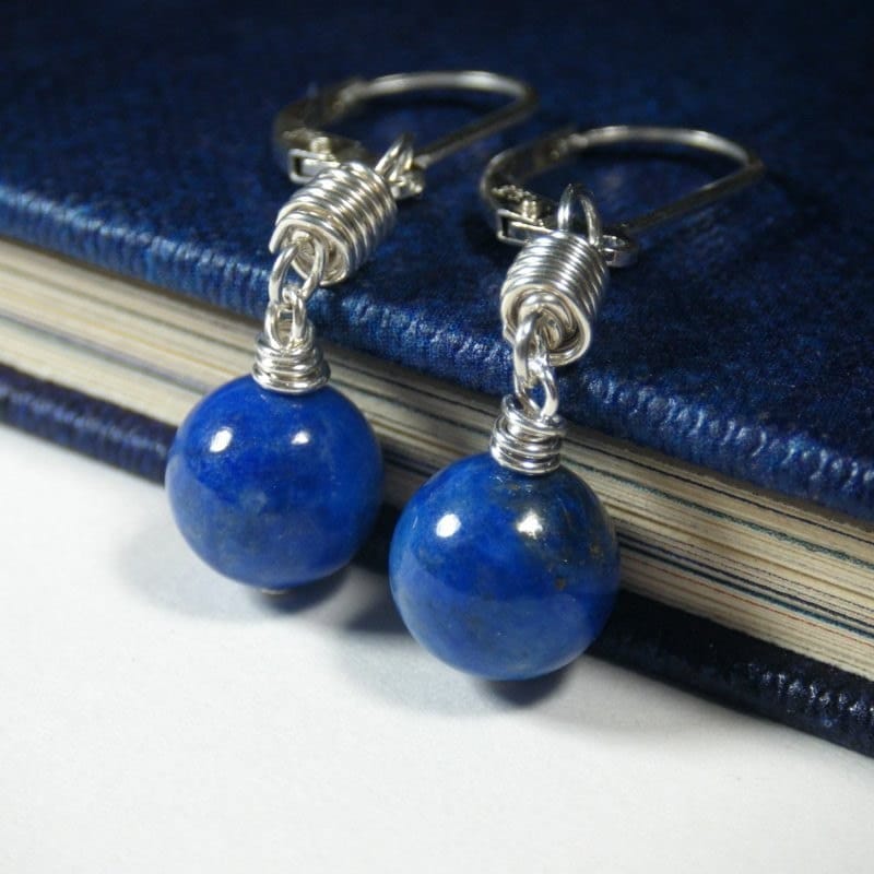
D. Handmade Lapis Lazuli Sterling Silver Earrings by Night Sky Jewelry
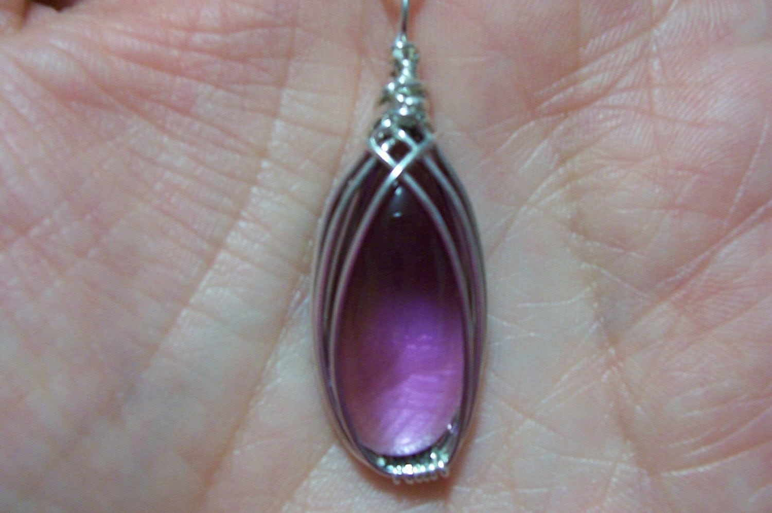
E. Purple and Sterling Pendant by Anna's Jewelry
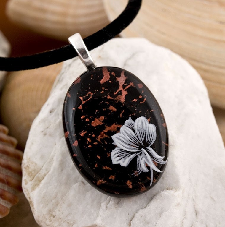
F. Copper Splash Fused Glass Pendant by Chauncey Design
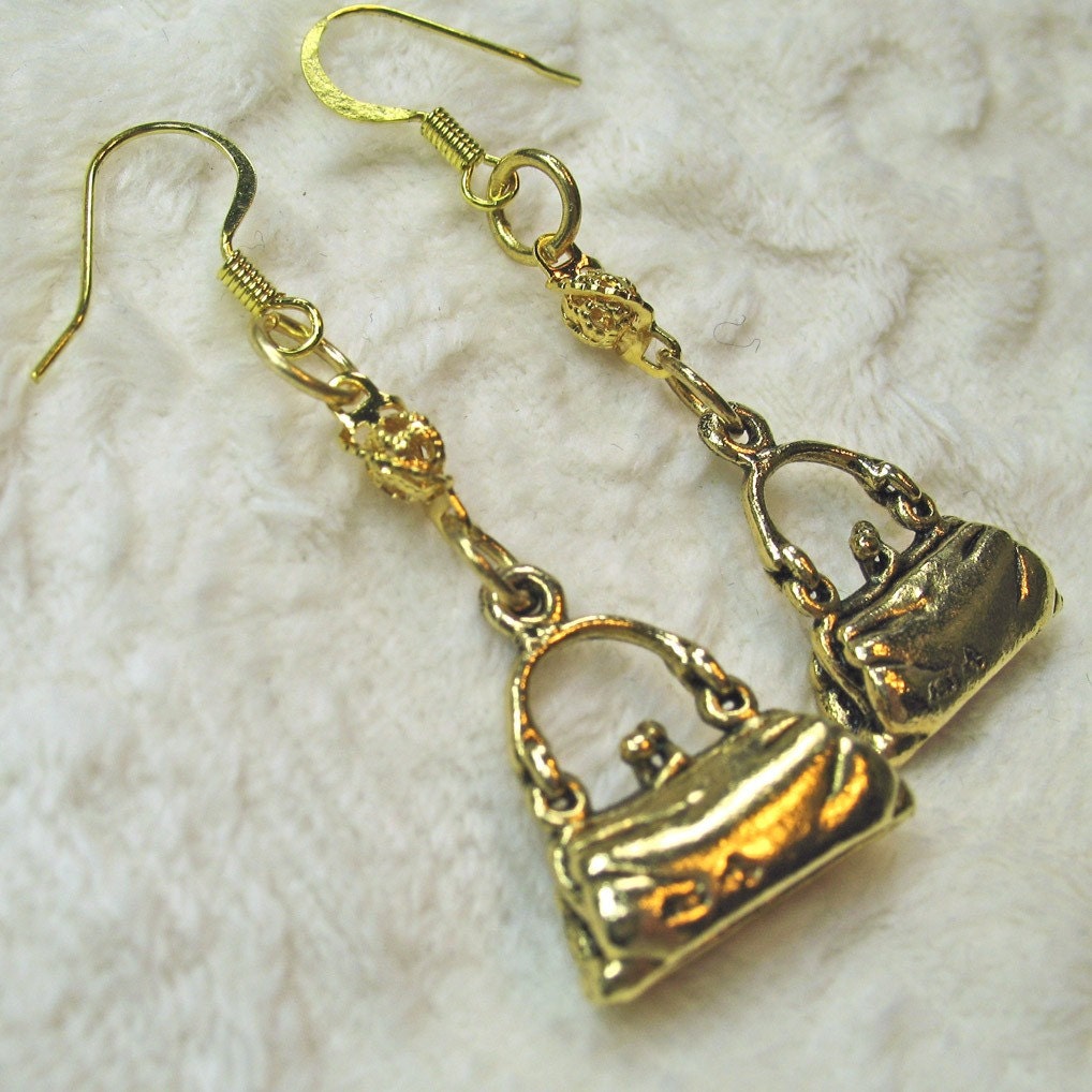
G. Shopaholic Dangle Earrings by Fantasy Creations 1
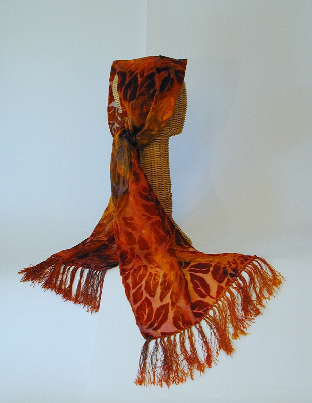
H. Rust and Red Velvet Scarf by Althea Peregrine
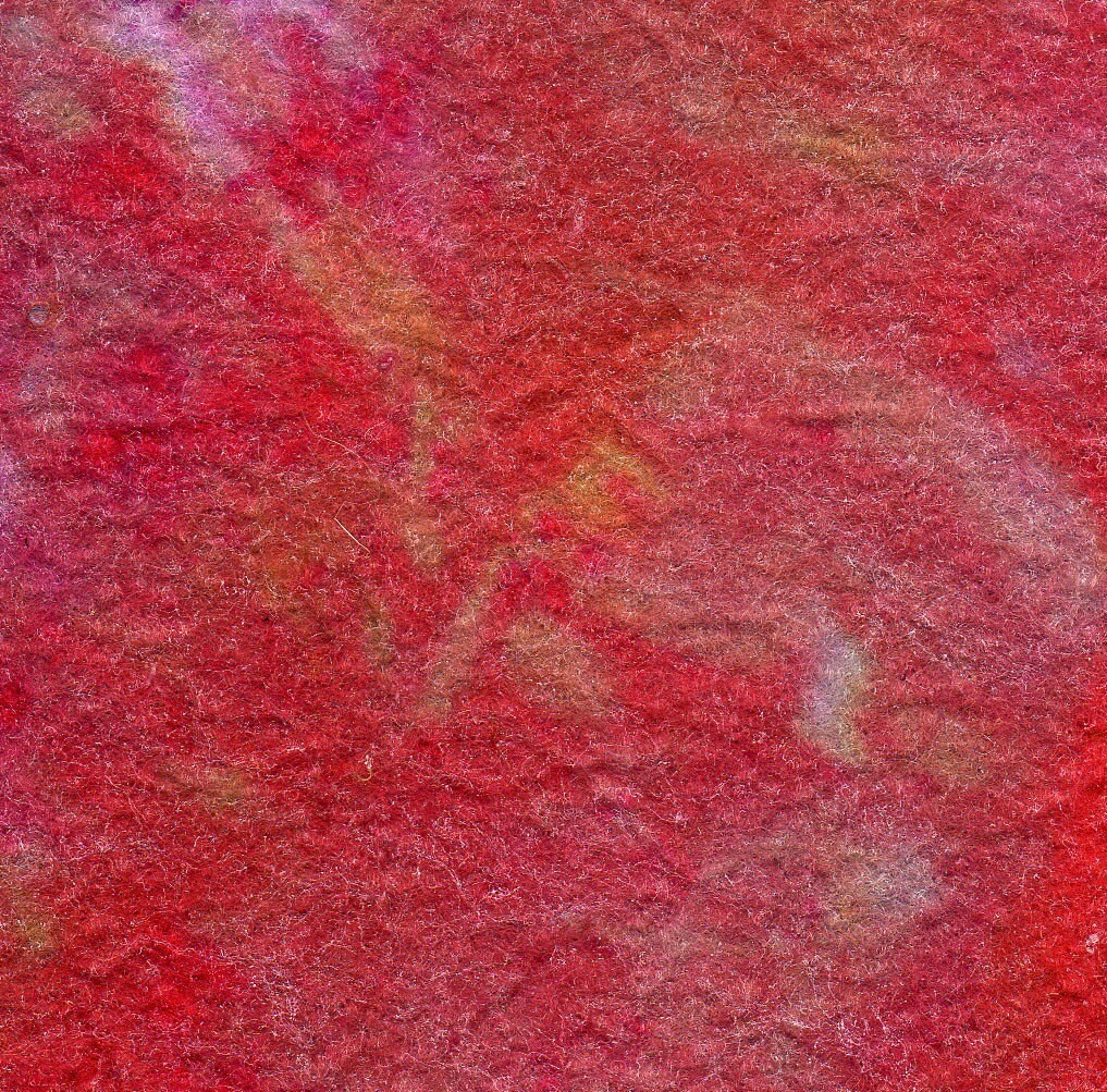
I. Fine Viscose Felt by Sassa Lynne
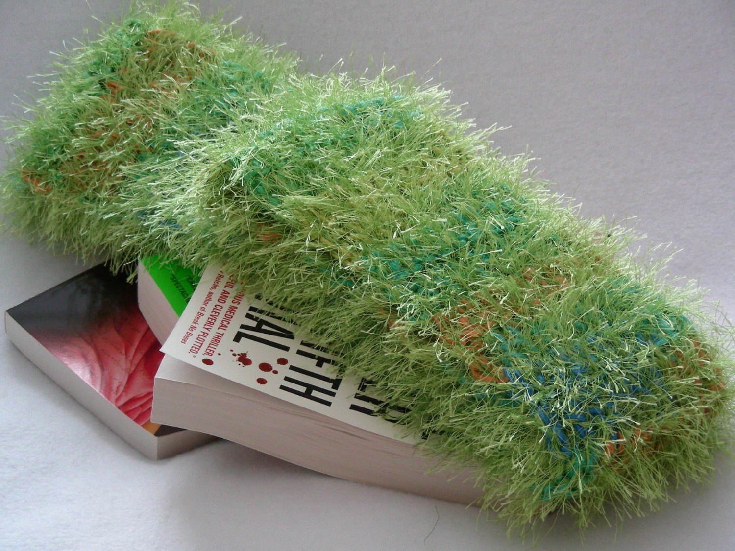
J. Whisper Soft Scarf in Lime with Multicolor Highlights by JN Originals

To explore more about color theory, here are some helpful resources:

http://en.wikipedia.org/wiki/List_of_colors
http://www.pantone.com/pages/pantone/Pantone.aspx?pg=19356&ca=29
http://www.colormatters.com
http://colortheory.liquisoft.com/
http://phrontistery.info/colours.html


Answers to the matching game will be published in the comments in a few days.