...but "rose," as a color, comes in many variations depending on who you are and the culture in which you live. Much of color description is subjective. By definition, color is "the quality of an object or substance with respect to light reflected by the object, usually determined visually by measurement of hue, saturation, and brightness of the reflected light; saturation or chroma." (Dictionary.com) In other words, pure white light is composed of an infinite spectrum of visible colors, though we only see a small percentage of them. The surfaces of all objects reflect some light wavelengths and absorb all the others. We perceive color when those reflected wavelengths reach the light receptors within our eyes and a message is transmitted to our brains. This working of the eye and brain together creates what we experience as color. (Pantone.com)
Because the human brain is such a complex entanglement of memories, sensory and physical experiences, cultural interpretations, emotions, and thought processes, perception of color becomes more than mere recording of incoming light waves. Each person will "see" a color differently based on this meshing of physical stimuli (light) and the stored information the brain uses for interpretation. Many of us are familiar with the basic hues of the color wheel, that rainbow-like, circular progression of colors that represents primary, secondary colors, and tertiary colors. We can thank Sir Isaac Newton for this neat diagram which he created in 1666. "The renowned English scientist was 23 years old at the time. He was made to stay home from Cambridge University for over a year because the plague that was sweeping Europe had closed it down. It was during this period that Newton performed his famous spectrum experiments. To alleviate the boredom of quarantine, he punched holes in the curtains of his darkened room to study the effects of light passing through a prism. The light separated into the same progression of colors found in the natural rainbow." (Pantone.com)
 |
| Courtesy of the University of Minnesota http://www.sustland.umn.edu/design/colortechniques.html |
Although some colors are generally agreed upon, finer distinctions of shade and exact hue vary widely from person to person. There isn't any standardization of color naming; even if there was, it would be difficult to tell exactly what color someone meant if he or she named a color because each person's brain interprets those light wavelengths differently. If I said an object was red, you might have a general understanding of what color I was talking about, but you might picture fire engine red while I was thinking of brick red. Some color names have been used interchangeably even though there are slight differences in hue. For example, aqua, aquamarine, cyan, turquoise, blue-green, green-blue, and verdigris are often used to describe some type of cross between blue and green. And lest you think that white and black are pretty safe to describe, keep in mind that even these "non-colors" can march subtly into the color spectrum. White might be antique white, champagne, eggshell, ivory, lavender blush, light goldenrod, linen, magnolia, or snow white; black could be charcoal, ebony, smoke, onyx, or jet black. It's all literally in the eye of the beholder. If any of you remember the 1948 Cary Grant and Myrna Loy movie, Mr. Blandings Builds His Dream House, you might recall this famous scene about paint colors that humorously illustrates how our views of color can cause a disconnect:
The list of colors in the English language alone is quite extensive. Some are very familiar, some are less common, and some are downright obscure. You may have heard of citrine, ochre, aubergine, azure, claret, and celadon, but could you point to something fulvous or piceous in color? Well, I admit I couldn't do so before I wrote this blog post! Let's explore a few unusual color names by means of a little matching game. Listed below are some colors that you may or may not recognize, followed by pictures of items made by members of the BBEST team. Try matching the color name with the item that most closely resembles that color...or take a best guess. Good luck!
 |
| A. Hummingbird On The Fly Pendant by Hemlock Hollow Creations |
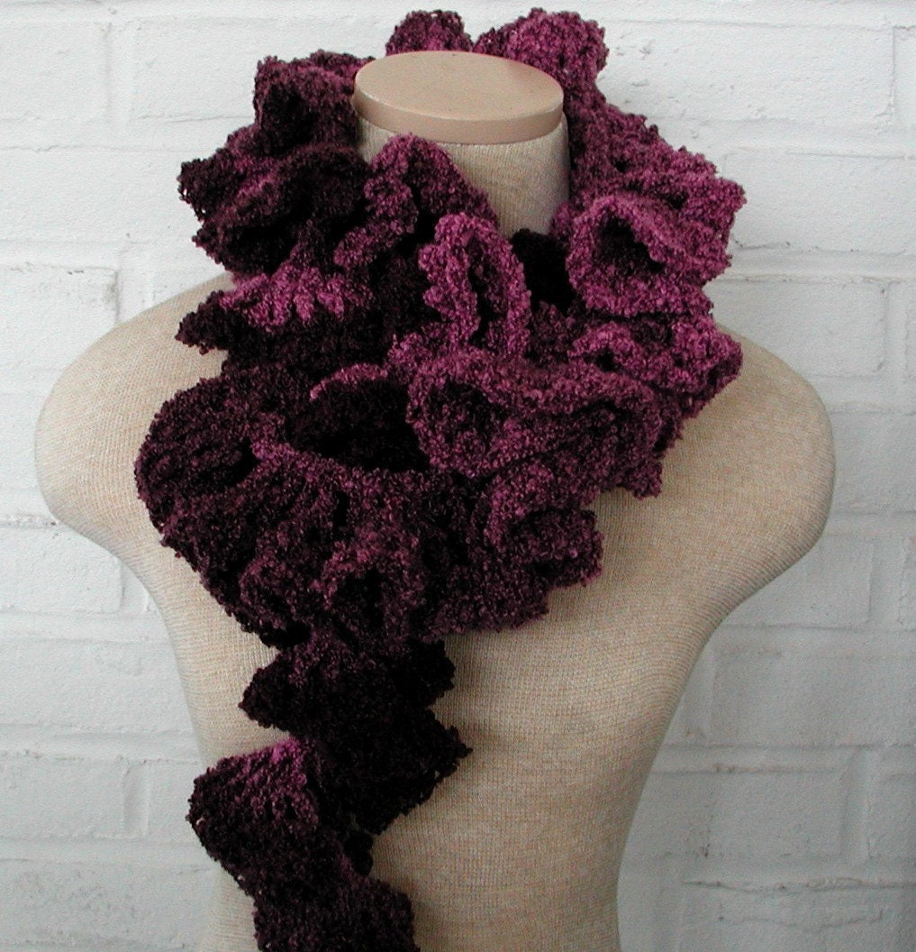 | ||||
| B. Burgundy Purple Ruffle Crochet Scarf by Blazing Needles |
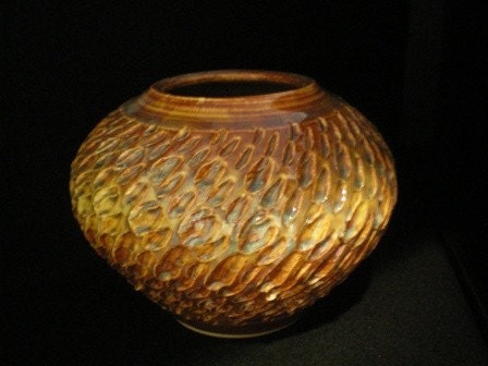 |
| C. Textured Golden Vessel by Artsielady |
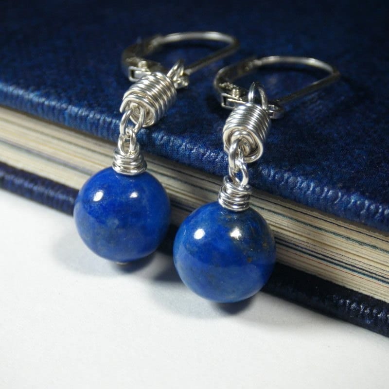 |
| D. Handmade Lapis Lazuli Sterling Silver Earrings by Night Sky Jewelry |
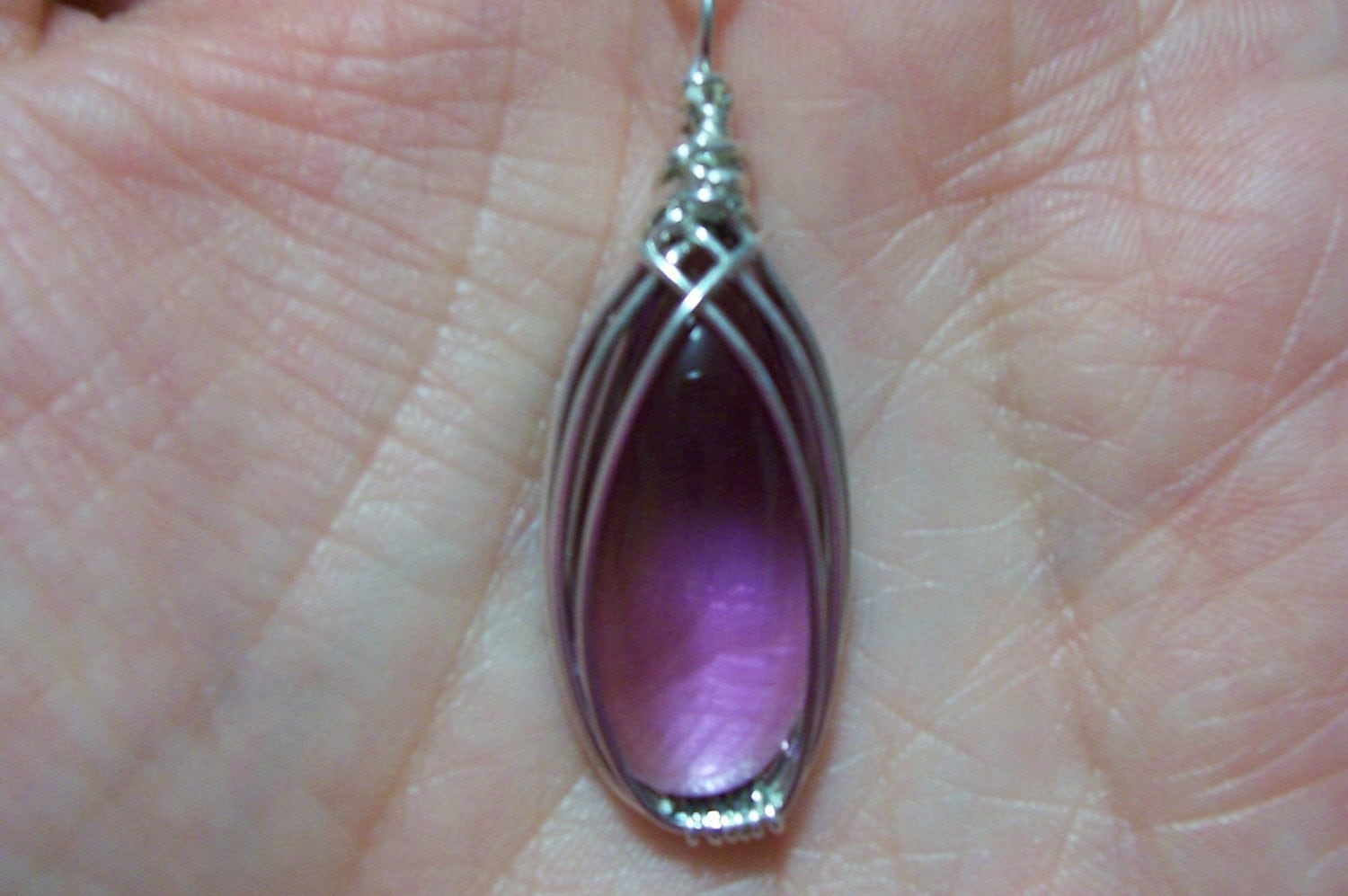 | |
| E. Purple and Sterling Pendant by Anna's Jewelry |
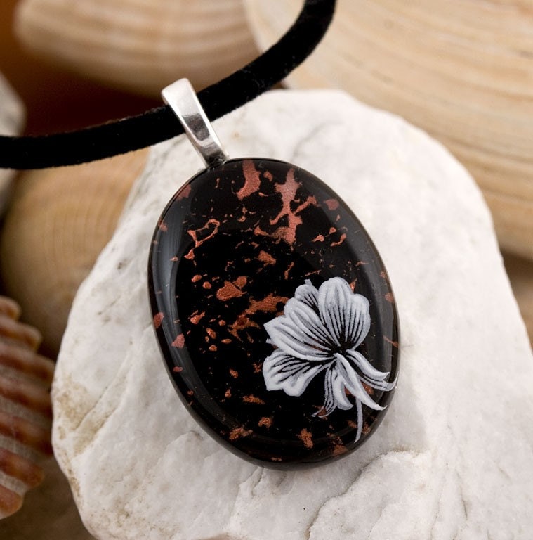 |
| F. Copper Splash Fused Glass Pendant by Chauncey Design |
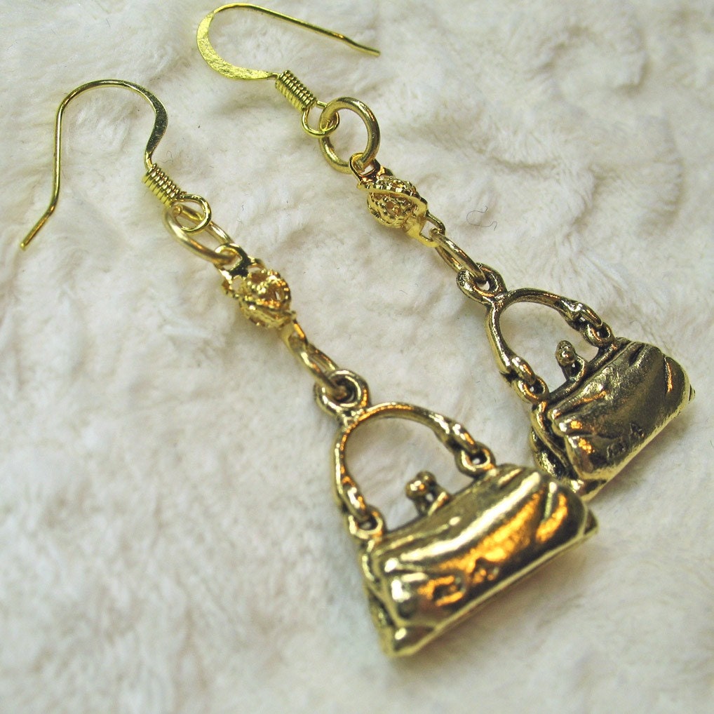 |
| G. Shopaholic Dangle Earrings by Fantasy Creations 1 |
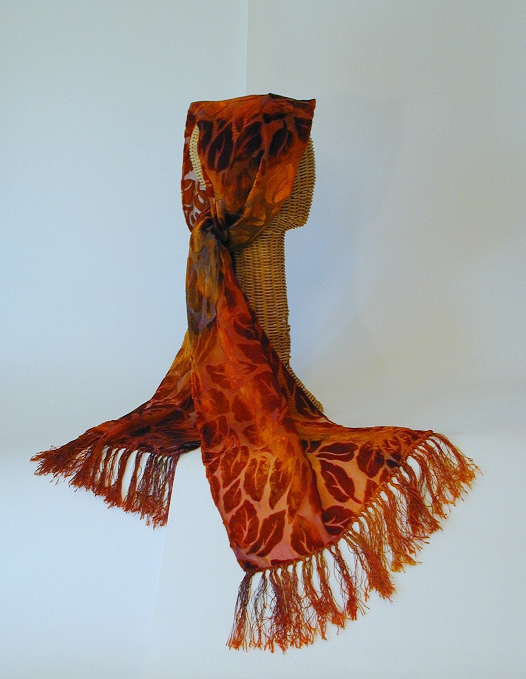 |
| H. Rust and Red Velvet Scarf by Althea Peregrine |
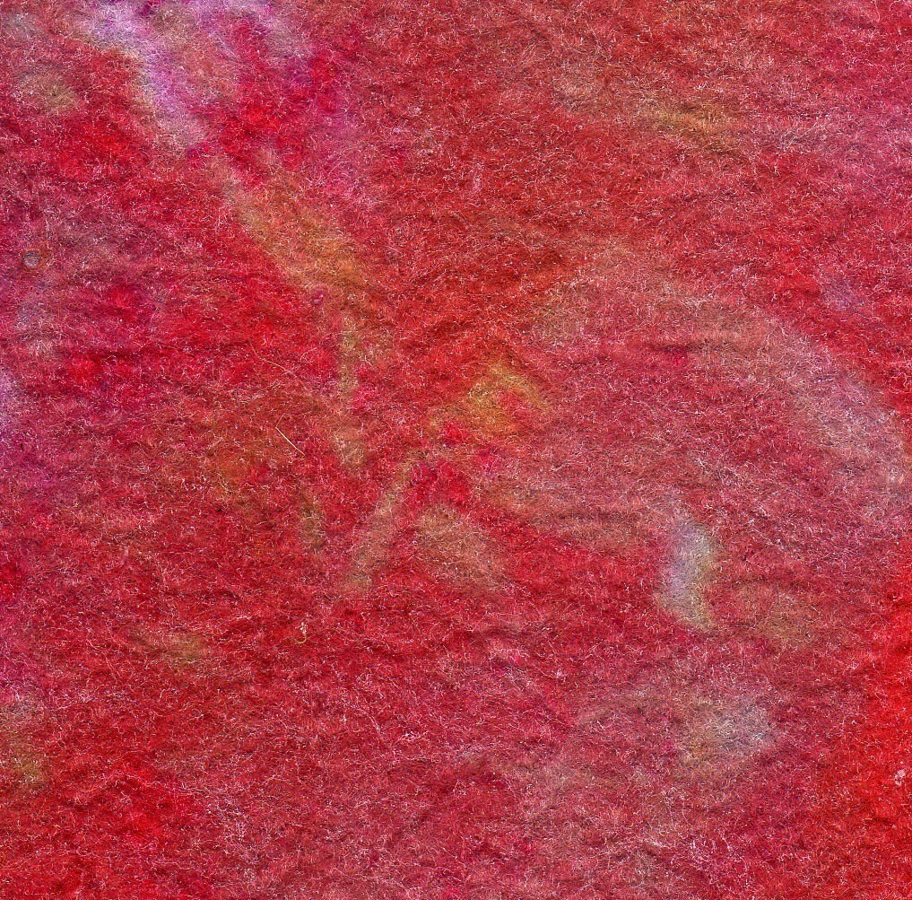 |
| I. Fine Viscose Felt by Sassa Lynne |
 |
| J. Whisper Soft Scarf in Lime with Multicolor Highlights by JN Originals |
To explore more about color theory, here are some helpful resources:
http://en.wikipedia.org/wiki/List_of_colors
http://www.pantone.com/pages/pantone/Pantone.aspx?pg=19356&ca=29
http://www.colormatters.com
http://colortheory.liquisoft.com/
http://phrontistery.info/colours.html
Answers to the matching game will be published in the comments in a few days.


